Promoting your brand is more than just selling products or services. It means to also communicate to your clients who you are as a company. Your company culture and the values, norms, and practices that define you as an organisation is a crucial aspect of this. And to understand the art of brochure design is to move one step forward.
Brochures, as tangible, interactive mediums, can be powerful tools in showcasing your company culture. Even though many things have gone digital now, brochures are still a classic strategy. It can tell a story about your company both to your clients and new talent you’re trying to acquire.
So in this article we will delve into the art of brochure design and see how to showcase your company culture effectively.
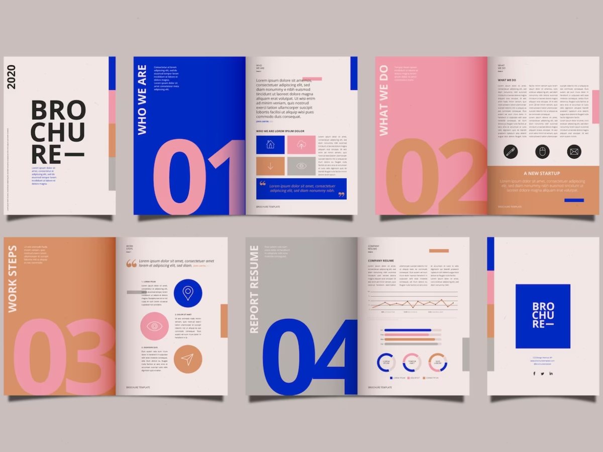
1. Set the tone with color
Our first recommendation is to start with the obvious – color. As you might know already, color can powerfully evoke emotions and set the mood for your brand. The palette you choose for your brochure should be consistent with your brand colors.
Think about it like a greeting the colors will give your people. It is your company’s first impression. It might go by subconsciously, but it might also create a sense of unity across all your marketing materials.
When translating company culture, the colors you use in your brochure can set the tone. For example, blue might be used to communicate trust and reliability, while green could signify growth and sustainability.
Coca Cola is a prime example of effective color usage. Their vibrant red is consistent across their materials, conveying excitement, passion, and energy. As a result the same feelings they aim to evoke with their beverages.
2. Visualize your brand
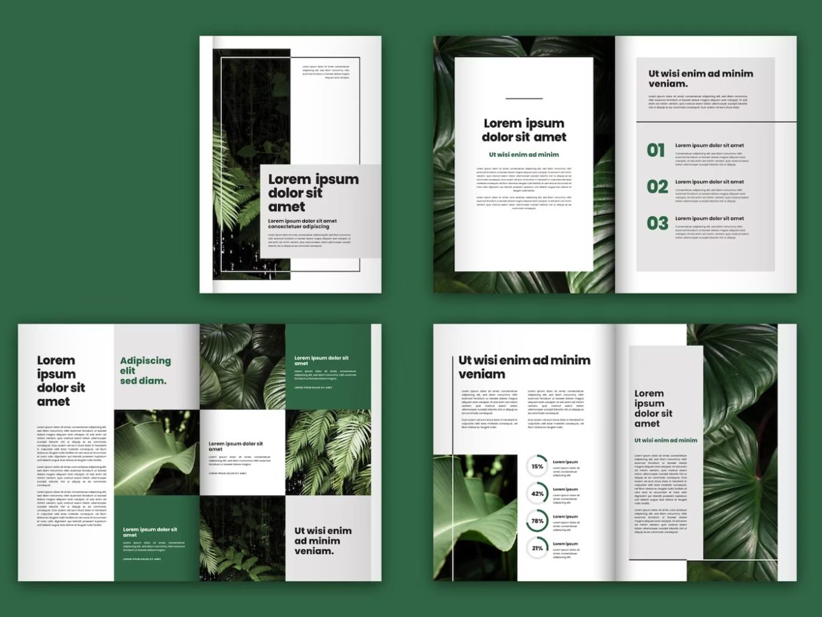
The saying, “A picture is worth a thousand words,” rings particularly true in brochure design. Images can succinctly communicate complex aspects of your company culture in an immediate, visually appealing manner.
So our tip for you is to choose imagery that reflects your company’s ethos. Photos of team members can highlight your commitment to a positive work environment. And then images representing community service or sustainability efforts demonstrate social responsibility.
To mention another example, Apple often uses sleek product images and minimalist designs. Those mirror their focus on innovation and simplicity, that we can all agree on wanting to have.
3. Use good typography
Typography, though often overlooked, can subtly communicate your company’s character. Font choices can have a significant impact on how your message is perceived. In this world it is hard to stay original yet your efforts to try will always be successful when the brand identity is clear.
Let’s see. A more traditional company might opt for serif fonts to communicate professionalism and reliability. On the other hand, a modern tech startup might choose clean, sans-serif fonts to emphasize innovation and forward-thinking.
Let’s take Google for another example. Google’s use of the simple, rounded sans-serif font in its logo and brochures conveys its approachable, user-friendly ethos.
4. Make sure your layout is guiding the reader
The layout of your brochure plays a vital role in guiding the reader’s journey through your company’s story. It should be intuitive and visually appealing. Remember that your brochure should show information that is easy to find and digest.
On the other hand, a cluttered layout can confuse readers and detract from your message. So make sure to leave plenty of white space, use clear headings, and organize content into sections.
An innovative company might experiment with unique fold patterns or interactive elements to stand out. For example, IKEA’s brochures often mirror their product’s simplicity and functionality with a clean, easy-to-navigate layout.
5. Logo placement will be your signature
Your company logo is your brand’s signature. Therefore its placement should be strategic. It should be easily visible but not overwhelming. Make sure it enhances your message without overshadowing it. Not too much, not too little kind of a thing.
A common practice is placing the logo on the front cover, where it can make an immediate impact. However, it can also be subtly incorporated throughout the brochure, such as in headers or footers.
6. Keep the storytelling alive
Every company has a story to tell – its origin, its mission, its vision for the future. Conveying these stories in your brochure can add a human touch and give readers a sense of connection with your brand. Make sure to not let it slide by.
We recommend you use engaging, personable language to narrate your company’s journey and mission. Images or timelines can be useful tools to visualize your company’s evolution.
For example, Starbucks often include their humble beginnings and growth story in their brochures. Thereby building an emotional connection with their audience which is what makes people trust your company more. Inspiring stories are what makes the brand likeable.
7. Sustainability is more important than ever
In today’s increasingly environmentally-conscious world, many consumers value businesses that prioritize sustainability. If this is part of your company culture, ensure it shines through in your brochure design.
For example, use images that portray your company’s eco-friendly initiatives. Consider using recycled or sustainably-sourced paper for your brochures. That will help you to reflect your commitment to the environment.
Because it is obvious how brochures are not the most conscious marketing strategy when it comes to saving the world. So make sure you let your customers know you’re aware. Use recycled materials to show that you care.
8. Try out interactive brochures
Interactive elements can make your brochure more engaging and memorable. They create a tangible connection between the reader and your brand. It will make your company culture more experiential.
Consider incorporating elements like QR codes linking to videos about your company, or fold-outs with more in-depth information.
Another idea is to use pop-up elements or tactile finishes that can also add an element of surprise and delight. For example, car companies often use brochures with pop-up features that give readers a 3D view of the car, reflecting their focus on design and detail.
In conclusion
Creating a good brochure that encapsulates your company culture is about finding a harmonious blend of color, imagery, typography, layout, and logo placement.
In conclusion we can summarize that through these mentioned elements, your brochure can become more than just a marketing tool. It can be a window into the heart of your company culture.
Remember that your brochure is a snapshot of your company culture. Make sure you put a lot of effort because knowing the true art of brochure design will bring you great success.
